When opening a Datasource you will be presented with the Table Visualization by default. Some visualization types have special customization options which are addressed in the Chart Types section.
- Save Chart: Saving a Chart.
- Customize: Additional customization options.
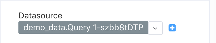
- Datasource: Creating and Editing Datasources.
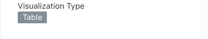
- Visualisation Type: Chart Visualization options.
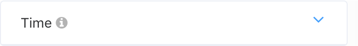
- Time: Time Column, Grain, and Filter.
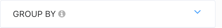
- Grouped by: Summarize columns into one, and measure them using a Metric.
- Not Grouped by: Summarize columns into one, not using a Metric.
- Query: Column Filters.
- Diagram Body: The current Diagram of your Query.


Save Chart
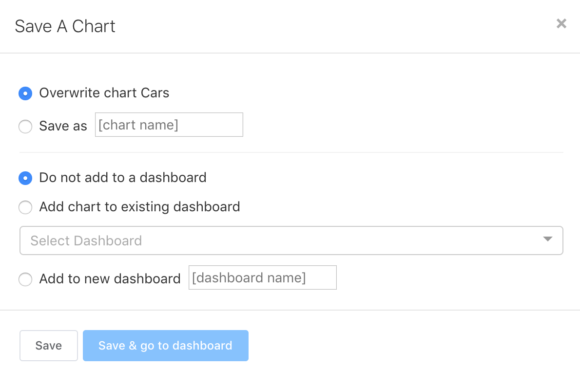
When saving your chart you have the options to overwrite your current chart, or give it another name to save it separately.
If you choose to add your chart to a dashboard right away you may create a new one or choose one that exists.
A saved chart can be added to a dashboard anytime, either here or in the dashboard customization.
Customize Chart
The Customizations tab addresses chart options that are independent of the data.
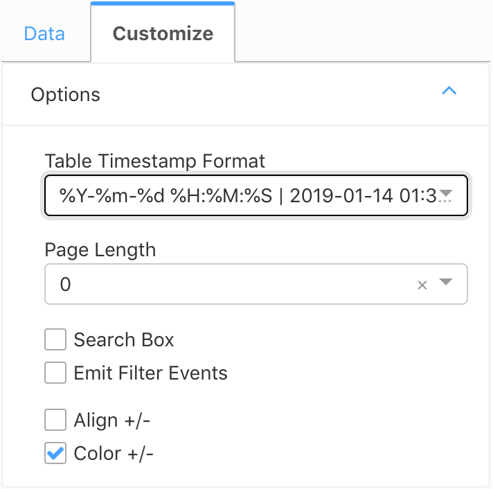
Table Timestamp Format: Changes the format of all ‘datetime’ columns in your chart.
Page Length: How many items to show per page. 0 results in one single page showing all rows.
Search Box: Tick this box to show a search box with this chart.
Emit Filter Events: When in a dashboard, filters applied to this chart will be applied to all charts.
Align +/-: Table-specific customization, handling visualisation of negative numbers.
Color +/-: Table-specific customization, handling visualisation of negative numbers.
Visualisation Type
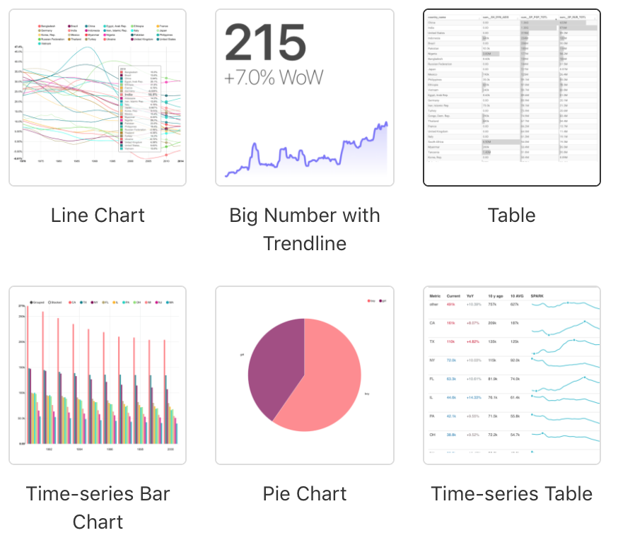
Superset comes with a wide range of visualisation types, including geo-spatial and time-series. While most of them are set up similarly to the table view, some will need special adjustments that are explained in built-in tooltips. Pay attention to the question marks when browsing (?). In addition to the usual Tables and charts you will also find the Data Entry Tables.
Time
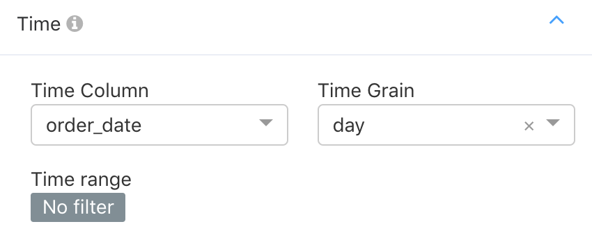
Column: Select a column of the datetime format.
Grain: Time grain from second up to year.
Filter: Time filters.
Grouped by
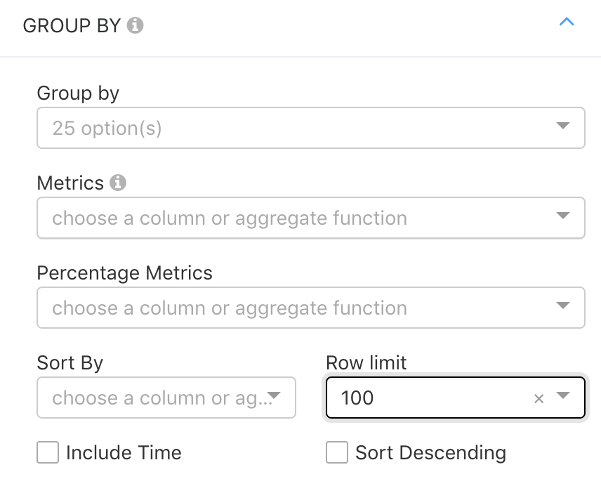
Grouped by: Selecting into which columns you want your output to be divided into. Selecting none will result in you Metric being displayed as a single number. Selecting all columns will be equivalent to your full SQL ouptut plus Metric.
Metrics: Select you measurement for this Graphic using one of the common SQL operands.
Percentage Metrics: Metrics as above but as Percentage of total.
Sort by: Choose what column to sort by.
Row Limit: Maximum number of rows displayed.
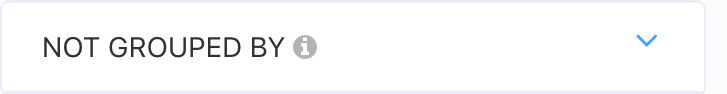
Not Grouped by
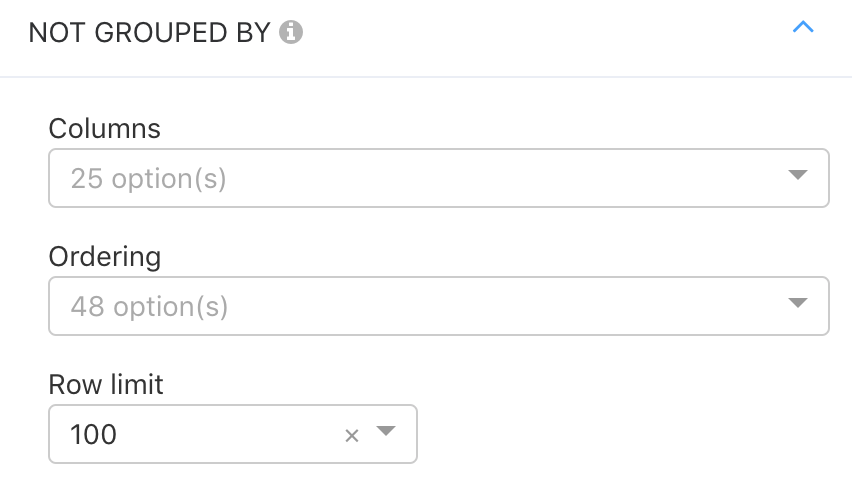
This section is Table-Chart-specific and does not exist in other Visualisation types. It has the same functionality as the ‘Grouped by’ settings, without a the Metric. Only one of the two may be applied at a time. Please take this as a sample of a Visualisation-specific functionality, that all Chart types have.
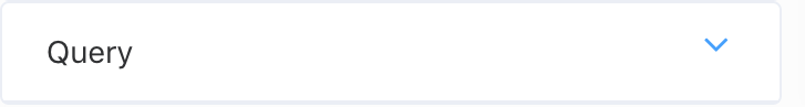
Query
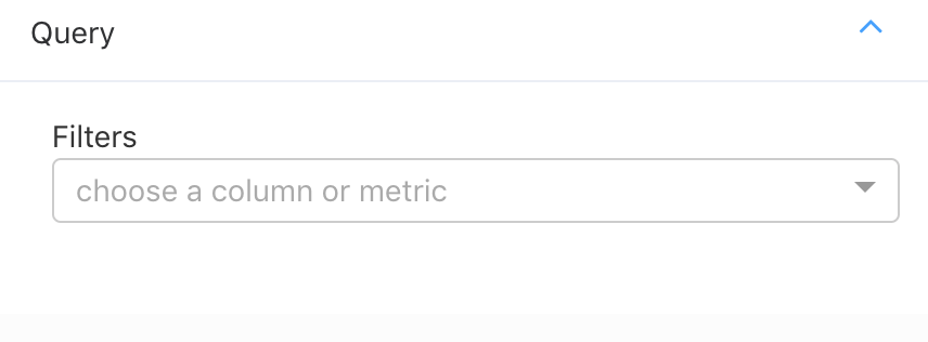
Apply filters to your columns, either using the built-in visualisation or by writing an SQL statement here.
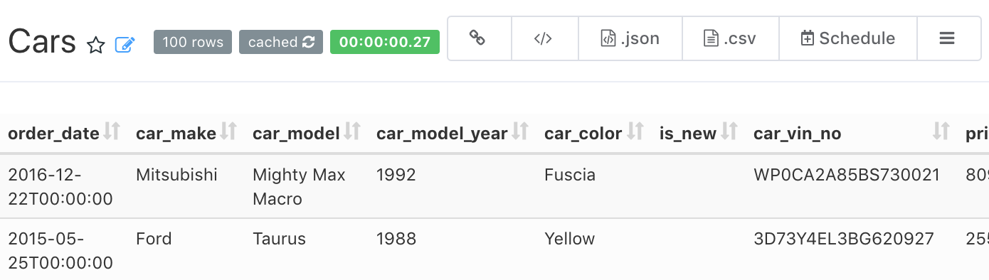
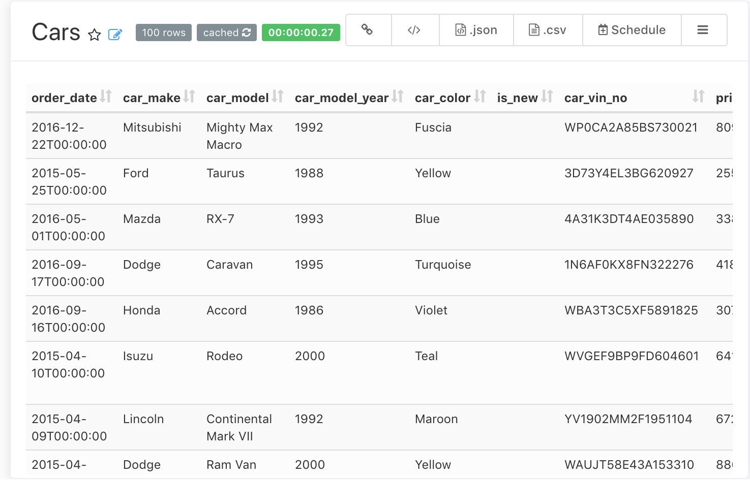
Diagram Body
The diagram body will change depending on your visualisation type. In its header there is additional information about your query, and options to export data and its SQl code. From left to right:
- Rows Displayed: The amount of rows returned in the query.
- Cache Status: Hovering displays the last data refresh - Click to force refresh.
- Query Runtime: Time to run current query.
- Link to your Chart: Generate and copy a link to your chart.
- <HTML Embedding>: Generate an <iframe> with width and height options.
- .JSON File Export: Generate a JSON format file of your data.
- .CSV file export: Generate a .CSV file of your data.
- Chart Scheduler: Open PushMetrics Report form with this chart attached.
- SQL Lab options: View your current query, its results, or take your query back to the SQL Lab.